

CHAPBOOKS AND BROADSIDES
Ernest Hilbert’s poems have been issued in a number of fine-art and letterpress editions as broadsides and small books from Tollund Press, Temporary Culture, his own Nemean Lion Press, and several others, alongside paraphernalia and event posters for his readings.
Nemean Lion Press is Hilbert’s own small, private press. Between 2008 and 2012 it issued three books, designed and bound by Jennifer Mercer and Melissa Moffa, a novelty beer bottle, and a number of promotional event posters, designed by Kara Mallon. Jennifer Mercer designed all of the promotional products for E-Verse Radio, Hilbert’s blog, as well as its logo and the E-Verse Equinox Reading Series poster. Melissa Moffa is part of a movement toward hand-made books that currently flourishes in Philadelphia. She incorporates cut paper illustrations into her book design and experiments with a variety of unusual binding techniques.
The Nemean Lion was a powerful beast believed by the ancient Greeks to have fallen from the moon as the child of Zeus, king of the gods, and Selene, an archaic lunar deity born of the Titans Hyperion and Theia (though other myths suggest that the lion was the offspring of the Chimera, a creature made up of many, including a lioness, a snake, and a goat; hence our term “chimera,” something that is difficult to understand; its siblings were Cerberus and the Lernaean Hydra). The Nemean Lion is named for the city of Nemea, which it terrorized. Heracles slayed the lion as one of his twelve labors and wore the lion’s pelt, which rendered him invincible.

 “EACH CLIMBER BRAND NEW IN HIS SKIN”: SIGNED LIMITED CONCERTINA EDITION OF THE THIRD COOPERATIVE FINE-ART BOOK BY DAVID YEZZI AND ERNEST HILBERT
YEZZI, David and HILBERT, Ernest [MOFFA, Melissa and MERCER, Jennifer]. Two Ranges [Vertical]. Philadelphia: Nemean Lion Press, 2013. Squat oblong quarto, cobalt blue cloth boards [two specially bound author copies in heavier, darker cloth], concertina paper column. 14pp. Measures 7 by 5 ½ inches on shelf, 36 inches fully extended.
Signed limited-edition chapbook featuring two alpine poems, one each by David Yezzi and Ernest Hilbert, on opposite facings of the vertically extendable concertina paper column, one of only sixteen total copies signed by both authors, only twelve for sale (two authors’ and two artists’ proofs, hors série).
Two Ranges [Vertical] is the third book from Nemean Lion to feature contrasting poems by David Yezzi and Ernest Hilbert. The first in the series, A Fletching of Hackles, showcased spirited dueling by way of light verse between the mutually aggrieved authors. Their second collaboration, 3 X 5, bound in dark blue snakeskin, addressed themes of freedom and obsession. Two Ranges [Vertical] displays David Yezzi’s sonnet sequence “Flatirons,” which debuted in the pages of Poetry magazine, and Ernest Hilbert’s four-decker “Glacier,” which first appeared in the Oxonian Review (Yezzi’s poem later appeared in his collection Birds of the Air in 2013, Hilbert’s in his collection Last One Out in 2019). Yezzi’s poem details the spiritual effects of a hair-raising free-climb on the infamous Flatiron rock formations near Boulder, Colorado (geomorphologically speaking, a flatiron is a precipitously sloping wedge-shaped surface formed by differential erosion of a rock layer that inclines in the same direction as but at a steeper angle than an exposed slope). Hilbert’s poem describes a brutal though considerably more gradual ascent through a summer storm to the lip of the Arapaho Glacier at 12,000 feet, also in Colorado. The two other climbers alluded to in the poem are David Yezzi and Charles Doersch (who led both ascents). The book is designed in a delightful concertina, or accordion, style that extends vertically to a full 36-inch spread in the reader’s hands, thereby suggesting the dizzying heights of the summits described in the poems. The bookmaker wrapped the cloth-bound boards and glued the concertina columns entirely by hand. Books signed by both Yezzi and Hilbert are certain to become increasingly scarce. The book is currently unobtainable, having sold out in its first week of sale.
* * *
 “HILBERT, ERNIE, / SHOULD GET AN ATTORNEY . . .”: SIGNED LIMITED EDITION OF THE FIRST TROUBLED COLLABORATION BETWEEN DAVID YEZZI AND ERNEST HILBERT
YEZZI, David and HILBERT, Ernest [MOFFA, Melissa and MERCER, Jennifer]. A Fletching of Hackles, Fresh Verse by Ernest Hilbert and David Yezzi. Philadelphia: Nemean Lion Press, 2009. Small folio, hand-sewn, paper title label, grey paper wrappers. 20pp. Measures 8 ½ by 5 ½ inches.
Signed limited edition of this delightful sequence of “dueling” clerihews and limericks, one of only 24 copies signed by designer, bookmaker, and both authors.
David Yezzi and Ernest Hilbert began trading insults as early as 2003, but it was only five years later that they began to hurl abuse at each other in poetic form (Sanders, 83). Employing comic verse forms of the clerihew and limerick, they fired broadsides at each other and were even known to time their violent verbal exchanges in the style of chess matches. Long known as ferocious enemies, each remained bent on burying the other with sheer odium, and they spent nearly a full month locked in a terrible and ceaseless mêlée that shocked and puzzled onlookers. In the summer of 2008, the two “poets” agreed to a brief and, as it turned out, fragile cease-fire, during which they compiled the inventions of their mutual loathing in what would later become A Fletching of Hackles, a collection inspired by ancient Fescennine rituals, which contained a form of Latin occasional verse, “chiefly lascivious wedding songs, of great antiquity, which perhaps originated as ribald or abusive songs sung at harvest festivals” (Princeton Encyclopedia of Poetry and Poetics, Fourth Edition.
A clerihew is a fanciful four-line poem first used by Edmund Clerihew Bentley, rhyming AABB, in irregular meter, addressing a famous historical figure. The first rhyme is traditionally given to the subject’s name, as in Bentley’s classic “John Stuart Mill, / By a mighty effort of will, / Overcame his natural bonhomie / And wrote Principles of Political Economy.” Notable clerihews have also been penned by G.K. Chesterton, Alger Hiss, and W.H. Auden, whose book Academic Graffiti is entirely devoted to the form. The limerick, a well-known comic verse form, consists of five lines rhyming AABBA in strict form, first popularized in English by Edward Lear. Because it has a long tradition of obscene subject matter, it is ideally suited for the pair’s ongoing “war of words.” By amplifying raw verbal hostility and personal abusiveness to levels “not encountered before,” Yezzi and Hilbert are thought to have “expanded the possibilities of both forms” (Kennedy, An Introduction to Poetry, 532). William Logan referred to the resulting poetry as more “akin to untreated sewage” than “anything we would call civilized poetry or discourse” when reviewing it for the Washington Post Book World.
The book was computer typeset by figure skater Jennifer Mercer when she probably should have been working on something important and hand-sewn by Elven bookmaker Melissa Moffa when she would rather have been out having fun. The portraits of the authors Mercer created for the cover may actually be more physically attractive than the men themselves. The type is set in Bernhard Modern, a serif typeface produced by Lucian Bernhard for the American Type Founders in 1937 in return for a half bottle of whiskey. It is known for its wide serifs, elongated ascenders, and big bottoms (it is sometimes embarrassed by its short descenders). For those incapable of using a dictionary, a “fletching” is the arrangement of feathers on an arrow and “hackles” the long narrow feathers on the neck of a fowl that are “raised” when the bird is irritated or threatened. The two selected the title in part because Yezzi has reported that “Hilbert looks remarkably like a turkey vulture chewing a length of intestine” to which Hilbert replied “yeah, well, you look like a sick pigeon that stayed up all night drinking cheap vodka.” A Fletching of Hackles is twice cited in David Sanders’ Rare and Irrelevant (22a and 22aa) and also in the third and least-significant appendix to Adam Kirsch’s Why Did They Bother? Poetic Feuds, 1928-2009 (16d.II-iv). This series is preceded by four artists’ and authors’ proofs, not intended for distribution, which include hand-die-cut portraits on gray paper over maroon wrappers. The book is currently unobtainable, having sold out in its first week of sale.
* * *
 “SUCH ROOT SATISFACTION . . .”
SIGNED LIMITED TÊTE-BÊCHE EDITION
OF THE SECOND BOOK BY DAVID YEZZI AND ERNEST HILBERT
YEZZI, David and HILBERT, Ernest [MOFFA, Melissa and MERCER, Jennifer]. 3 X 5 [Three by David Yezzi, Five by Ernest Hilbert]. Philadelphia: Nemean Lion Press, 2010. Small tête-bêche folio, hand-sewn, Prussian-blue, faux-snakeskin binding, cutaway title windows, stiff eggshell-blue wrappers. 16pp. Measures 8 ½ by 5 ½ inches.
Signed limited-edition chapbook featuring two sequences of poems, one each by David Yezzi and Ernest Hilbert, approaching from two directions as separate books, one of only 12 copies signed by designer, bookmaker, and both authors, only eight for sale (two authors’ and two artists’ proofs).
This sleek “snakeskin” tête-bêche (from the French “head-to-toe”) volume consists of two separate books, rotated 180° relative to each other, that may be read with equal satisfaction from either direction, as Yezzi’s “Three” or Hilbert’s “Five,” meeting at the book’s center, which features inverted mirror-facing limitation pages. Yezzi’s three contributions are the poems “Itchy,” “The Ballade of In-between,” and “Free Period.” Hilbert’s five are “Drift,” “Ashore,” “Panthera,” “4AM Cab Ride,” and “While You Were Out.” The poems originally appeared inAntioch Review, LineBreak, New Ohio Review, Parnassus, Poetry, Think Journal, Vocabula Review, and Yale Review. Both limitation pages are signed by bookmaker Melissa Moffa, designer Jennifer Mercer, and authors David Yezzi and Ernest Hilbert, accompanied by the press’s official blue Nemean Lion chop stamp; thus all books in the series are double-signed by all four creators. Books signed by both Yezzi and Hilbert are destined to become increasingly scarce. All copies were sold two weeks before publication.
“WE’LL HEAD OUT, YOU AND ME, HAVE A PINT, OR / MAYBE THREE, A COOL THIN ALE, LIKE SUNLIGHT”: SIX PACK POEMS BY ERNEST HILBERT
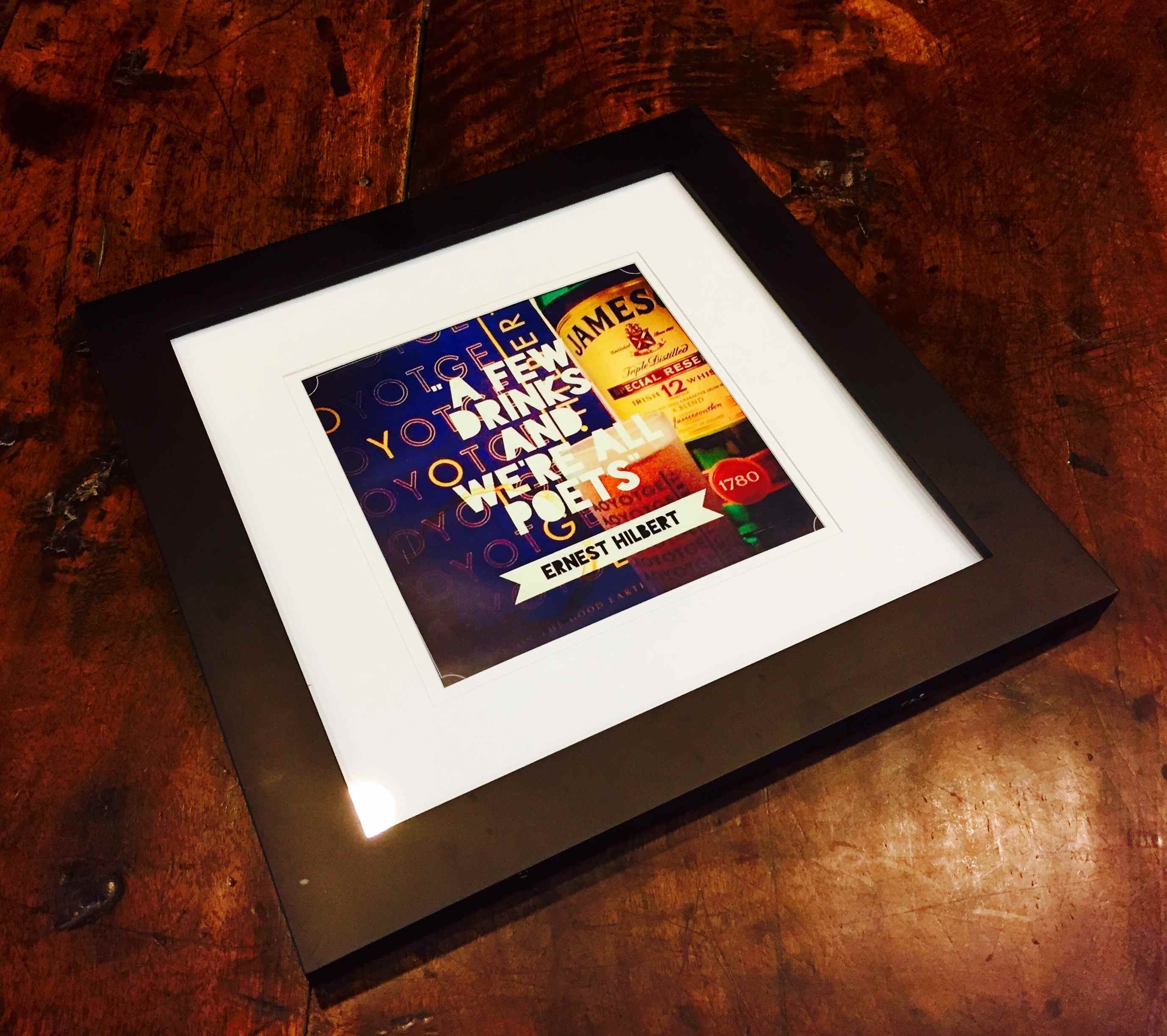
(HILBERT, Ernest) MERCER, Jennifer and MOFFA, Melissa. Six Pack Poems. Philadelphia: Nemean Lion Press, 2009. Six brown glass 12 oz. beer bottles, original paper labels, aluminum caps, poems on hand-made paper scrolled and tied with blue silk, in white cardboard carrying container. 50¢ deposit CT, DE, HI, CA, IA, ME, MA, MI, NY, OR, VT
Signed editions of Hilbert’s promotional “six pack poems,” six beer bottles with custom labels, “brewed by Ernest Hilbert,” “contents: one sonnet,” containing six poems about beer, each signed by Hilbert, designer Jennifer Mercer, and bottler Melissa Moffa.
Jennifer Mercer’s custom beer label for Hilbert’s promotional six packs is based on her own design for Sixty Sonnets as well as vintage beer labels such as Ortlieb’s, Pabst, and Genesee. Each bottle contains a poem from Sixty Sonnets that references beer: “Church Street,” “A Few Drinks and We’re All Poets,” “Cautionary Tale; or, What Comes Up Must Come Down,” “Up Late on a Work Night: A Lament,” “Improprieties,” A Sad Last Number for the Gentlemen at the Tavern.” The six packs are periodically available at Hilbert’s readings in bars such as KGB and Bowery Poetry Club in New York City. The first six pack was numbered, though bottles were distributed to different recipients. Later editions are not limited, and there is no intention of limiting the series in the future.

* * *
 “SCARCEST OF ALL HILBERTIANA”
(RED HEN PRESS) HILBERT, Ernest. Sixty Sonnets Chocolate Bar. Los Angeles: Red Hen Press, 2009. Chocolate bar (sugar, chocolate, cocoa butter, cocoa processed with alkali, milk fat, lactose, soy lecithin, PGPR, vanilla, artificial flavor, milk) housed in beige pictorial paper wrapper over folded silver foil. Measures 7 by 2 1/2 inches, 1 inch thick.
One of an unknown quantity manufactured by Hilbert’s publisher Red Hen Press for promotional use at the launch and signing event for Hilbert’s first book Sixty Sonnets (Associated Writing Programs conference, Chicago, February 2009).
It is assumed most copies were consumed by book fair browsers over the three days of the conference. The only known remaining copy (pictured) resides in the personal collection of the author and is considered the scarcest of all Hilbertiana. A charming piece of publishing ephemera and a glimpse into the increasingly bizarre world of author promotion.
* * *
 “KEEPING WITH THE TRADITION”
(RED HEN PRESS) HILBERT, Ernest. AoYotGE [All of You on the Good Earth] Beer Coaster. Los Angeles: Red Hen Press, 2013. Square Pulpboard Coaster, 3.375 inches square.
250 beer coasters manufactured as promotional giveaways with a design adapted by Jennifer Mercer from the cover of Ernest Hilbert’s second full-length commercial poetry collection, All of You on the Good Earth.
In keeping with the tradition of beer-related items (see Six Pack Sonnets) used to promote Ernest Hilbert’s books, the coasters were distributed by the publisher and at public readings given by the author, many of which occurred in drinking establishments, beginning with the publication party and record release [Elegies & Laments] upstairs at Fergie’s Pub in Philadelphia. One of the more unusual items of Hilbert ephemera. Increasingly scarce.
* * *
Publisher’s merchandise associated with Hilbert’s books and album includes (clockwise from top left) Sixty Sonnets refrigerator magnet, AOYOTGE post card, AOYOTGE vinyl sticker, AOYOTGE beer coaster, Elegies & Laments vinyl sticker, and Sixty Sonnets vinyl sticker. Collect all seven!
* * *
 “OB / Original Barbarian.” T-shirt, black, four sizes with one toddler size, limited to 24 silk-screened and one out of series. Designed by Jennifer Mercer after Hilbert’s idea for aging metal heads assuming a variant on “OG’s” or Original Gangsters. Shirts were distributed to regular attendees of Hilbert’s semi-annual “Metal Nights.”
* * *
 “CAL.” T-shirt, black, 100% cotton. This is a unique item, commissioned by Ernest Hilbert and designed by Jennifer Mercer. It depicts American poet Robert Lowell alongside his nickname “Cal,” which was given to him by classmates as a boy. His rough and imperious behavior earned him the epithet which refers either to Caliban, the wild man “not honour’d with a human shape” of William Shakespeare’s late play The Tempest, or the Julio-Claudian Roman emperor Caligula, infamous for his brutal and capricious reign (Gaius Julius Caesar Augustus Germanicus earned the nickname Caligula, which is the diminutive of caliga, or “small soldier’s boot,” while campaigning with his father in Germania). Diantha Parker recalls in an essay how her father remembered young Lowell as “someone other boys seemed instinctively to shun,” going on to add that her father believed that “there was a darkness wherever [Lowell] went.” There is only one shirt. No copies will be made.
* * *
“I FACE AN OCEAN, ITS LURID RUSH AND PULL”: LIMITED-EDITION SIGNED BROADSIDE FROM TOLLUND PRESS
HILBERT, Ernest. Franco Salas-Borquez. “Pelagic.” Broadside signed. Essex County, MA: Tollund Press, 2022. Letterpress printed in two colors on 17” x 7” 100% cotton text stock (bottles) or 100% cotton 1-ply (unbottled).
Limited-edition letterpress broadside of Ernest Hilbert’s swimming poem “Pelagic,” including artwork created by Chilean artist Franco Salas-Borquez, signed by the poet, sixty total copies, six on smaller paper bottled—three released into the Gulf Stream in the spring of 2022—fifty-four larger format unbottled, six copies hors de commerce. Three sealed “poems in a bottle” were stowed aboard The Charlotte, a J120, 40-foot sloop, and borne along the course of the 2022 June Newport-Bermuda Race, known as the “Thrash to the Onion Patch,” which takes places largely in the Gulf Stream, where the bottles were set loose from the vessel.
The cresting wave art was created by Franco Salas-Borquez, a Paris-based Chilean painter and sculptor born into a seafaring family on the island of Chiloé. Borquez’s dramatic large-scale seascapes capture primordial sense of elemental terror in the chaos of storms and fierce currents. The line-drawing was commissioned and created for this broadside. It was digitized and then transferred to a photopolymer plate for printing.

The six broadsides in bottles are printed on 100% cotton text stock (118 gsm, 8 pt) and the fifty-four unbottled broadsides on 100% cotton 1-ply cover stock (318 gsm, 20 pt). All sheets printed on a 5,950-pound Original Heidelberg GT. The poem and its title are set in Mathew Butterick’s font Equity, an elegant variation of Times, originally designed for clarity and legal use. The colophon is set in Orpheus, designed by Kevin King and Patrick Griffin after “late 1920s designs by Walter Tiemann, who had an impressive talent for combining classic Roman proportions and Art Deco sensibilities.”
The broadside features the official blue-ink Nemean Lion chop stamp on the reverse, dated in Hilbert’s hand. The numbering in felt-tip pen on the limitation was accomplished by Ann Drourr. The poem first appeared in The Hopkins Review, Volume 13, Number 2, Spring 2020 and again in the book Storm Swimmer, UNT Press, 2023. The broadside includes a description card printed on the Heidelberg. Grains of sand collected by the poet in the Florida Keys was added by the printer to the six bottles. Grains of Himalayan salt were also added in order to absorb humidity and moisture from the corks. The bottles were corked using a Grifo Italian Floor Corker. The bottles were sealed with navy blue sealing wax manufactured by Blended Waxes, Inc. Vice Commodore Richard L. West of the Stamford Yacht Club released the bottled poems into the gulf stream during the June 2022 Newport-Bermuda Yacht Race. Two earlier strikes of the broadside on different paper were destroyed as the inking was deemed insufficiently even. The publisher builds custom wood frames for the broadsides, some using reclaimed ship timbers. Inquire directly at Tollund Press.
It is the second broadside issued by the press.
* * *
“I’VE KNOWN BEAUTY ALMOST IMPOSSIBLE / TO BELIEVE”: LIMITED-EDITION SIGNED LETTERPRESS BROADSIDE OF ERNEST HILBERT’S POEM “LAST RITES” WITH ARTWORK BY HIS SON
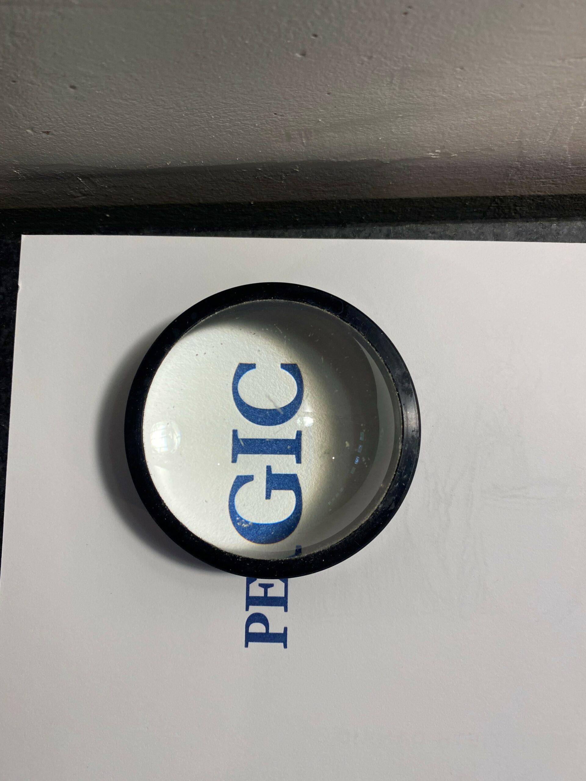
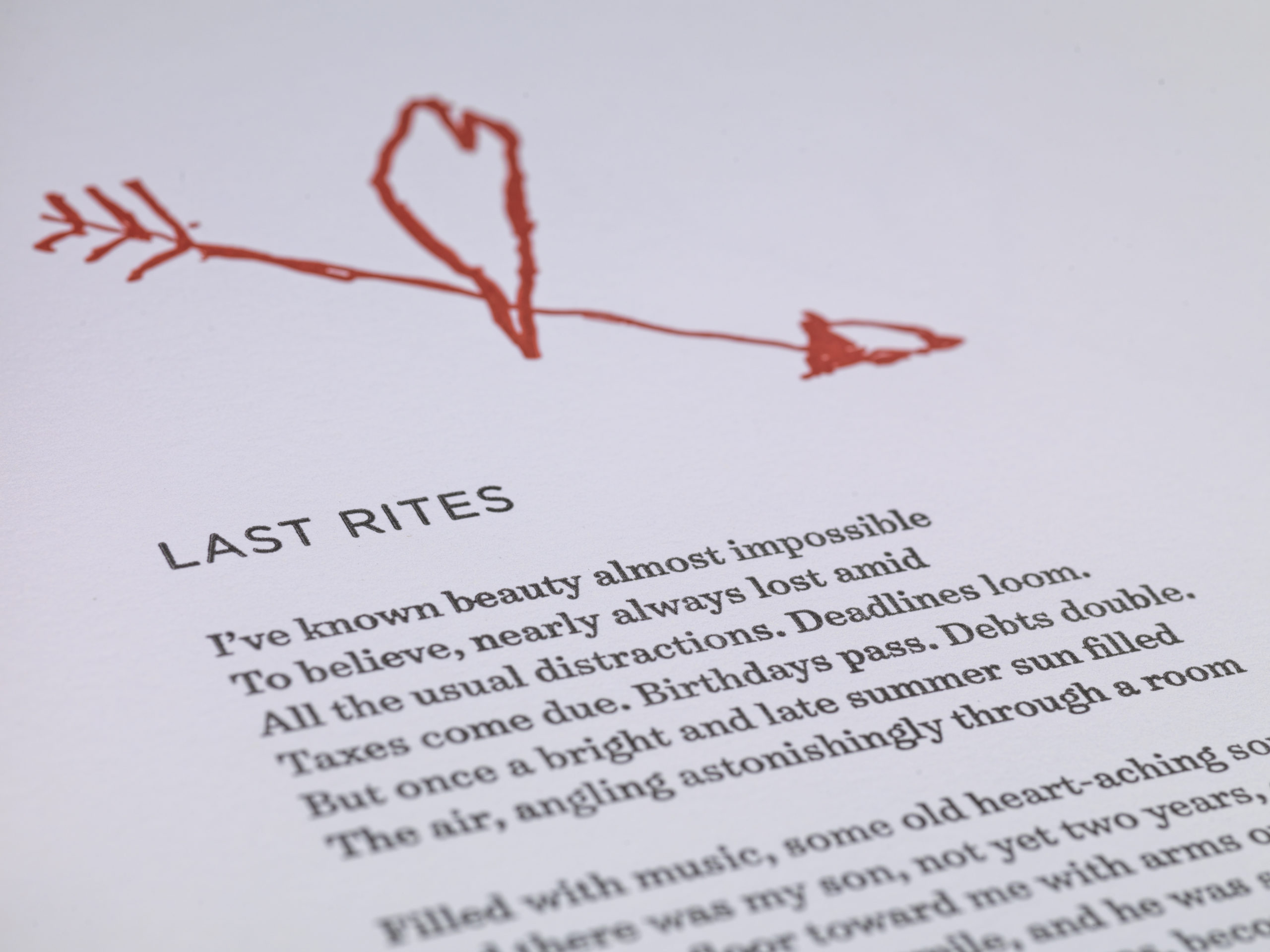
HILBERT, Ernest (Ian Hilbert). “Last Rites.” Broadside signed. Essex County, MA: Tollund Press, 2021. Measures 12 by 18 inches. Letterpress printed in two colors on 12″ x 18″, 118-lb. 100%-cotton cover stock.
Limited edition letterpress broadside of Ernest Hilbert’s fatherhood poem “Last Rites,” including “Ian’s Arrow,” an artwork created by the poet’s son, Ian, 24 numbered and signed copies (four copies hors de commerce).
In 2020, Christian Schoenberg, the founder of Tollund Press, obtained a 5,950-pound Original Heidelberg Platen Press and refurbished it over the course of a year, having missing parts machined locally or sent from as far away as China. While visiting the press in Essex County, Massachusetts, the author’s son was asked by the publisher to “draw anything” that came to his mind. The resulting artwork, known as “Ian’s Arrow,” was first accomplished in pencil, then inked over with ballpoint pen and then further widened with marker by the young artist, who was 5 years old at the time. The image was then transferred to a photopolymer plate for printing.
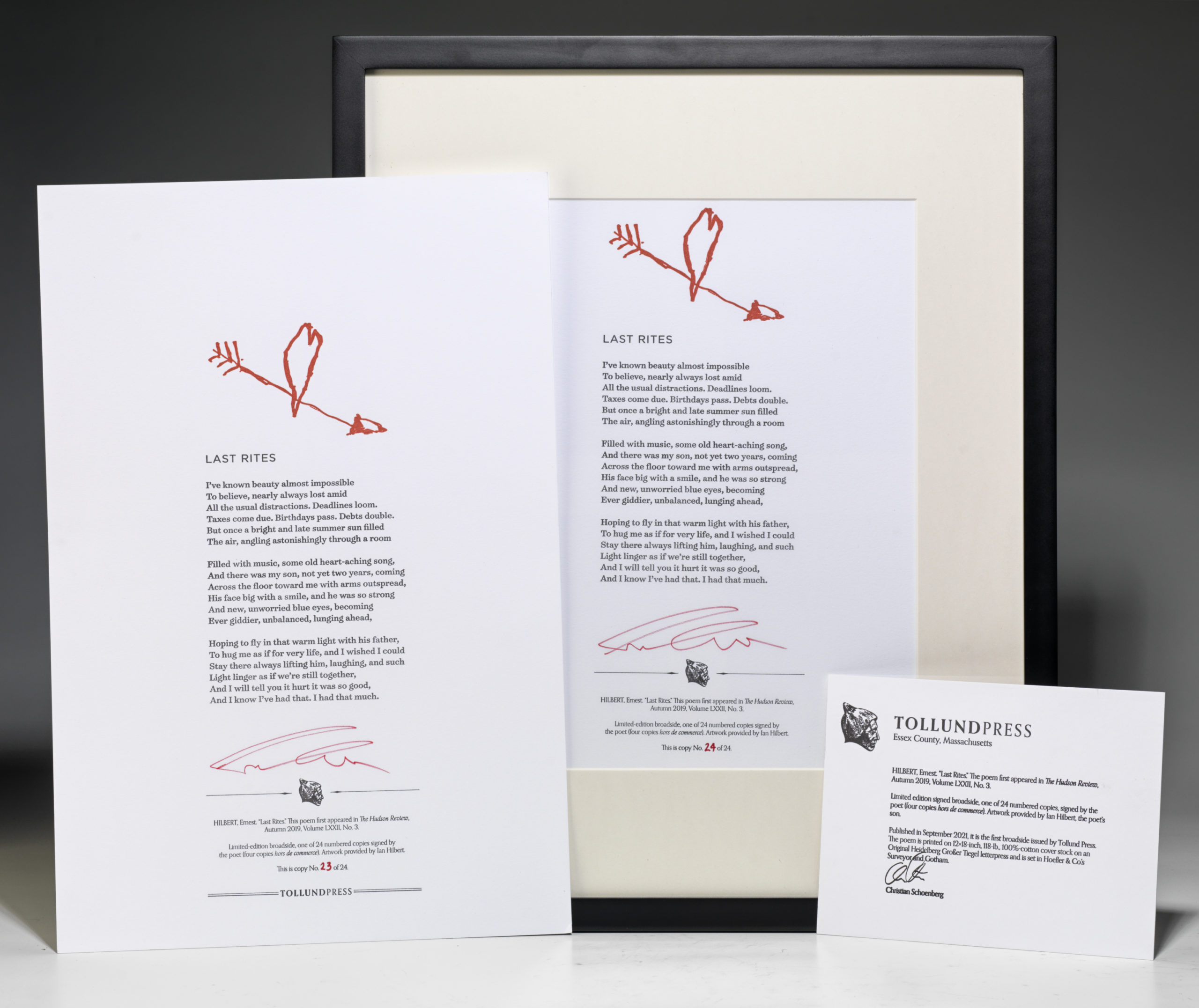
The poem and artwork are printed on 12″ x 18″, 118-lb. 100%-cotton cover stock on an Original Heidelberg Platen Press manufactured in Germany by the fabled Heidelberger Druckmaschinen. The poem is set in Hoefler & Co’s Surveyor (designed by Tobias Frere-Jones in homage to the characteristic form of lettering on engraved maps) and Gotham (a sans-serif with geometric structure designed by Tobias Frere-Jones with Jesse Ragan and inspired by mid-twentieth-century architectural signs). The numbering in felt-tip pen was performed by Ann Drourr. The broadside features the official red-ink Nemean Lion chop stamp on the reverse, dated in Hilbert’s hand. The poem first appeared in The Hudson Review, Autumn 2019, Volume LXXII, No. 3.
It is the first broadside issued by the press.
* * *
“TODAY, THE SAILORS HAUL THE YARDS”: LIMITED EDITION LETTERPRESS BROADSIDE
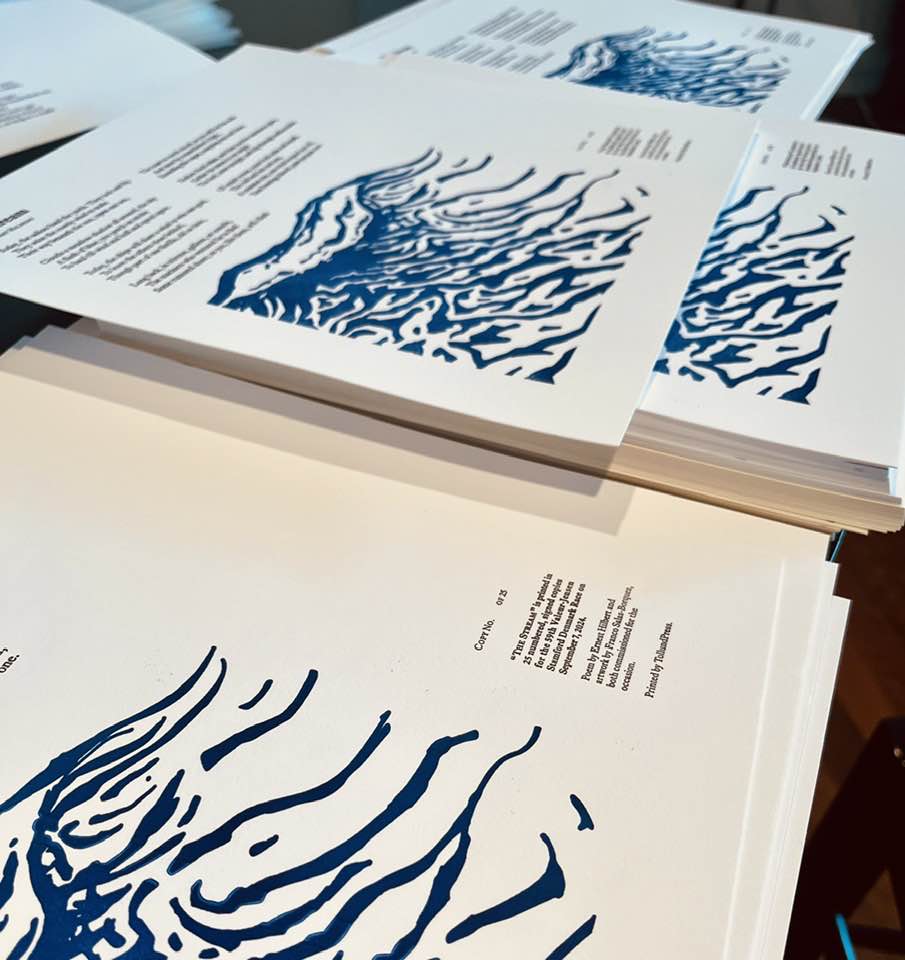
HILBERT, Ernest. Franco Salas-Borquez. “The Stream.” Broadside signed. Essex County, MA: Tollund Press, 2024. Measures 12″ x 12″. Letterpress printed on 118# (318 gsm, 20pt) soft white and bright white 1-ply “Flurry Cotton” cover stock.
Limited edition letterpress broadside of Hilbert’s dedicatory poem, 25 copies signed and numbered by the author, with an unknown number of out-of-series copies, four issued with frames hand-made by the owner of the press, one each for the yacht clubs, one for the author, and one retained by the press.
Limited-edition letterpress broadside of Ernest Hilbert’s poem “The Stream,” commissioned as the dedicatory poem for the 2024 Valeur-Jensen Stamford Denmark Race, held annually on the first Sunday after Labor Day, between the Stamford Yacht club and the Royal Danish Yacht Club. Hilbert was invited to deliver the poem at the banquet held the evening before the race. Other speakers included Danish ambassador to the US Helle Meinertz, Crown Prince Joachim of Denmark, Danish Fleet Captain Haxthausen, and Commodore Anne Sofie Munk-Hansen. The title of the poem refers to the Gulf Stream, though the race takes place entirely within the confines of Long Island Sound.
The accompanying art is by Franco Salas-Borquez, an ink wash painting using Faber-Castell Pitt Artist Pen Brush Black 199 on fountain paper, 100% Cotton 26 x 36 cm, 10.2 x 14.1 in, fine grain, cold pressed. The painting was digitized and then transferred to a photopolymer plate for printing. The title is set in Surveyor and the body in Equity font.
Of the 25 numbered and signed copies, four were retained by the yacht clubs, press, and author. The remaining 21 were intended for the captains of the winning boats on the day of the race, though the Danish fleet captain mistakenly distributed an undetermined number of out-of-series copies as well (possibly as many as 25 or more), some with uneven register or ink blots (therefore held back from intended distribution), to other sailors during the awards ceremony.
* * *
 “BEEHIVES AND BELLBOTTOMS ALWAYS STAY IN STYLE”: FINE LIMITED EDITION LETTERPRESS BROADSIDE
HILBERT, Ernest and ALGEO, Robert James. “All of You on the Good Earth.” Upper Montclair, NJ: Printed by Wolfe Editions for Temporary Culture, 2008. Oblong broadside. Measures 15 by 11 inches.
Signed limited edition broadside featuring the sonnet “All of You on the Good Earth” by Ernest Hilbert illustrated with a punch-card created by artist Robert James Algeo, and printed by David Wolfe at Wolfe Editions, Portland, Maine, in an edition of 50 numbered copies signed by the author with a smaller number additionally signed by the artist (2 copies, hors série, signed by publisher and author).
Science fiction publisher Temporary Culture commissioned poet Ernest Hilbert to compose a sonnet for its 2008/2009 New Year’s greeting. “All of You on the Good Earth” pays tribute to the heroic far-sightedness of the best science fiction writers, while also serving as a useful reminder of the short-sightedness that limits all human endeavor. Hilbert jokingly refers to “3-D videophones” operated with the now obsolete “rotary dial” once common to telephones in the last century. Bellbottoms and beehives, fads and fashions, are assumed to be permanent while science carries humanity forward. Clerks in the furthest reaches of the galaxy continue to file reports using now ancient typewriters. Milk is no longer delivered to our doorsteps, but a science fiction novelist might have once imagined clones on their appointed rounds. The poem is both homage and cautionary reminder, issued at a time of year when readers are urged to take stock of the past while cautiously planning for the future.
The title of the poem is drawn from the historic broadcast of the Apollo 8 space mission. At the end of the annus horribilis 1968, a year that saw many tragedies and civil unrest around the globe, Apollo 8 successfully circumnavigated earth’s moon, “the first human voyage to another world” according to the Boston Globe. On Christmas Eve, the crew observed the earth rising for the first time over the moon’s horizon. Commander Frank Borman later described the earth-rise as “the most beautiful, heart-catching sight of my life, one that sent a torrent of nostalgia, of sheer homesickness, surging through me.” He then signed off: “Good night, good luck, a Merry Christmas, and God bless all of you—all of you on the good Earth.”
The punch-card provided by Algeo was created with online software and delivered as a digital file to the printer, David Wolfe, who used it to create a photopolymer plate for the press. This ironic technological regression—from contemporary software to digital image of early computer punch-card to plate for inking—intrigued and delighted both printer and publisher. The card printed here is characteristic of those used with IBM card processing equipment from the 1930’s onward. If processed, this punch-card will reveal a line from the Bob Dylan song “Abandoned Love”: “Won’t you let me in your room one time ’fore I finally disappear?” The song was originally penned for the 1976 album Desire but was only released to the public in 1985 on the compilation album Biograph. The type is set in the rare font Jenson Eusebius, designed by Richard Beatty and Nicolas Jenson. A lovely example of the letterpress print-maker’s art, on fine paper, bottom edge untrimmed.
Copies are now in the collections of singer Patti Smith, David G. Hartwell (editor, New York Review of Science Fiction), Michael Swanwick, Don Webb, John Crowley, the Lilly Library, the science fiction collection of Texas A&M, The New Criterion, Parnassus, Jonathan Galassi, Poetry Society of America, The Academy of American Poets, Poets House New York, Joe Haldeman, Concord Poetry Center, and the libraries of several private collectors. The last copy on the market sold before the end of 2009, and the broadside is currently unobtainable.
* * *
 “AS IF WE’RE BORN FOR WAR AND IT FOR US”: FINE PRESS LIMITED EDITION OF “AGAINST THE ART OF WAR”
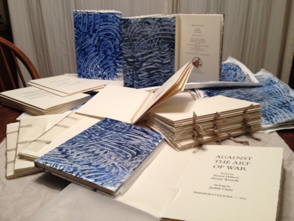
HILBERT, Ernest, Henry Wessells (contributor), Judith Clute (artist). Against the Art of War. San Francisco, London, Upper Montclair: Temporary Culture, 2013. Tall octavo, hand-made paste-paper boards, 16pp.
Fine press limited edition of Ernest Hilbert’s poem “Against the Art of War” and Henry Wessell’s poem “Wars End,” with three tipped-in aquatint etchings created and printed by London-based Canadian artist Judith Clute, letterpress printed by David Wolfe of Portland, Maine, hand-bound in paste paper boards, in an edition of 26 lettered copies, signed by the authors and the artist, and five numbered copies reserved for artist, authors, and printer.
In the summer of 2012, author and fine-press impresario Henry Wessells commissioned Ernest Hilbert to write an anti-war poem for a still-untitled fine-press art book to be issued as the second in a series by Temporary Culture, Wessell’s own press, which specializes in collectible science fiction and art books. The resulting poem, “Against the Art of War,” appeared first in this limited edition and was later included in Hilbert’s 2019 collection, Last One Out. The artwork for the edition was provided by Judith Clute, a Canadian artist resident in London. In 2008, Temporary Culture published Clute’s etchings along with the poem “Forever Peace. To Stop War” by Joe Haldeman, author of the science-fiction classic The Forever War (1974). Clute apprenticed to Francoise Andre and Charles Stegeman in the early 1960s, and her work has been shown internationally. David Wolfe has worked as a master letterpress printer since 1979 and renowned printmaker since 1998. He teaches at Harvard, Dartmouth, Wellesley, and elsewhere. Text and etchings are printed on 300 fsm Somerset, 100% cotton, pH neutral, mouldmade in England by St. Cuthberts Mill, internal and surface sized, 2 natural deckles. Somerset is known for its excellent quality for printmaking. The aquatint etchings are tipped to supports of Fabriano Ingres laid paper. Temporary Culture Press derives its name from a phrase that came to founder Henry Wessells in a dream while an undergraduate at Princeton. He has remarked that “upon examination, it contains a critique of the marble academy and any pretensions to cultural permanence.” Within a month of the book’s publication, all 26 lettered copies sold to private collectors as well as special collections libraries at Duke University, Yale University, the Lily Library, and Poets House in New York City. The series is sold out.
* * *
“THERE’S ONLY ONE OF ME / (IT’S NOT THE ONE YOU SEE)”
NFT OF ERNEST HILBERT’S POEM “RIDDLE ME”
HILBERT, Ernest. “Riddle Me.” NP: Opensea, 2021. Non-fungible token.
NFT edition of Ernest Hilbert’s NFT-themed poem “Riddle Me,” the first poem using rhyme and meter to be minted and sold in an encrypted digital form.
Ernest Hilbert’s poem “Riddle Me,” written specifically for use as NFT art (non-fungible token art, a form of financial security made up of digital data deposited in a blockchain, or distributed ledger), was made available for sale using the cryptocurrency Bitcoin through OpenSea, a peer-to-peer marketplace for rare digital items and crypto-collectibles housed at the Hunter College MFA program in New York City. It was posted for sale March 18, 2021 with the aid of Alexander Szymanik. Although “Riddle Me” cannot lay claim to being the first poem (or item described as a poem) issued on the crypto market as an NFT, it is the first to use meter, rhyme, and repetition, which are ancient techniques essential to many uses of the art form throughout history. While it may be charitably classed as a novelty or occasional poem, it signals the dawn of a new range of possibilities for poets and collectors of poetry first editions.
The New York Times explains that “An NFT is a piece of artwork stamped with a unique string of code and stored on a virtual ledger called a blockchain . . . when an artist uploads a piece of art and clicks a button to ‘mint’ it [it] starts a process known as mining, which involves complex puzzles, awesome computing power and a huge load of energy. That’s because Ethereum, the platform of choice for NFTs, uses a method called proof of work to create digital assets like nonfungible tokens. To successfully add an asset to the blockchain’s master ledger, miners must compete to solve a cryptographic puzzle, their computers rapidly generating numbers in a frenzied race of trial and error . . . The miner who arrives at the right answer first is the winner, and gets . . . his asset added to the blockchain.”
While crypto art may confuse some readers and pose aesthetic difficulties for others, possibly some older users, it is likely that younger ones will feel increasingly comfortable with the basic concept, as they tend to be with crypto currencies. When Walter Benjamin, in his important 1936 essay “The Work of Art in the Age of Mechanical Reproduction,” envisioned an original painting possessing an aura—”its unique existence at the place where it happens to be”—that cannot be communicated by copies, could he have imagined an NFT, and what would he have thought of it? Where would one locate the “aura” of a poem, in the handwritten manuscript, a recording of the poet reading it aloud, a first printed edition, a first appearance on social media? Can or should poetry be assigned monetary value? Do poets deserve to be paid for their poems? If so, how?
![]()
Hilbert’s fascination with the subject of currency and workings of monetary systems began while he was enrolled at Oxford University in the 1990s working on his doctorate in the department of English Language and Literature (completed in 2000). On a whim, he acquired US dollar bills from the Royal Bank of Scotland and used a laser printer in the Middle Common Room computer facility at St. Catherine’s College to print his poem “Dollar”—a short meditation on the nature of money—directly onto the bills. The bills were then released into circulation in the United States through payment at stores and in machines that accept paper money. His more recent effort, “Riddle Me,” is a poem in the ancient tradition of the riddle, essentially a playful attempt to describe NFT art. The title hints at the solution (“Riddle Me” rhymes with “NFT”) while also working as a gruesome double entendre, as when one is “riddled” with bullets (itself a play on the sarcastic idiomatic phrase “great, just shoot me,” a sardonic quality exhibited in his poems beginning with his first commercially published books, Sixty Sonnets, 2009).
Since the sale of a single NFT work of art for nearly $70 million at Christie’s in early 2021—a digital collage titled “Everydays: The First 5000 Days,” created by artist Mike Winkelmann, known as Beeple, over 13-and-a-half years—interest in the possibilities of crypto art has quickened, leading many aspiring artists, and now a poet, to contribute to the field. This revolution in artistic production and distribution raises many questions, some as old as art itself, and opens many new opportunities for artists and, perhaps, with poets as well. “Riddle Me” may be remembered as an early foray into the realm of NFT poetry. It is the only example of Hilbert working in this medium.
* * *
LIMITED EDITION POSTERS
Kara Mallon and Jennifer Mercer are part of an emerging group of exciting young designers in Philadelphia. They work in various media and have served as the exclusive designers of promotional posters for Ernest Hilbert’s appearances since 2008. Posters are issued from Hilbert’s own Nemean Lion Press for sale at specific readings. They are all currently unobtainable.
* * *
 Posters of various kinds have existed for hundreds of years, but the modern poster dates to 1870, when color lithography made mass production possible. “In little more than a hundred years,” writes poster expert John Barnicoat, “it has come to be recognized as a vital art form, attracting artists at every level, from painters like Toulouse-Lautrec and [Alphonse] Mucha to theatrical and commercial designers.” Concert posters have ranged in styles from Art Nouveau, Symbolism, Cubism, and Art Deco to the more formal Bauhaus and the often garish hippie posters of the 1960s. Posters advertising poetry readings have become popular collectors’ items on the rare book market, the most famous among them being the “Six Poets at Six Gallery,” a poster for an evening organized by Kenneth Rexroth for poets Philip Lamantia, Michael McClure, Allen Ginsberg, Gary Snyder, Phil Whalen, Kenneth Rexroth, and Jack Kerouac—“[a] remarkable collection of angels on one stage”—on October 7, 1955 in San Francisco, though it should be noted that the poster is memorable more for the event it advertised than its impromptu design. With the advent of digital production and printing technology, a new generation of poster artists has begun to expand the field of the concert poster while building upon earlier traditions. Kara and Jennifer stand out as two of the most interesting graphic artists working in this field today.
* * *
 “STRONG GRAPHIC NON-STOP LANGUAGE [SIC]”: LIMITED EDITION POSTER ADVERTISING RED HEN IN NYC, AUTUMN 2013
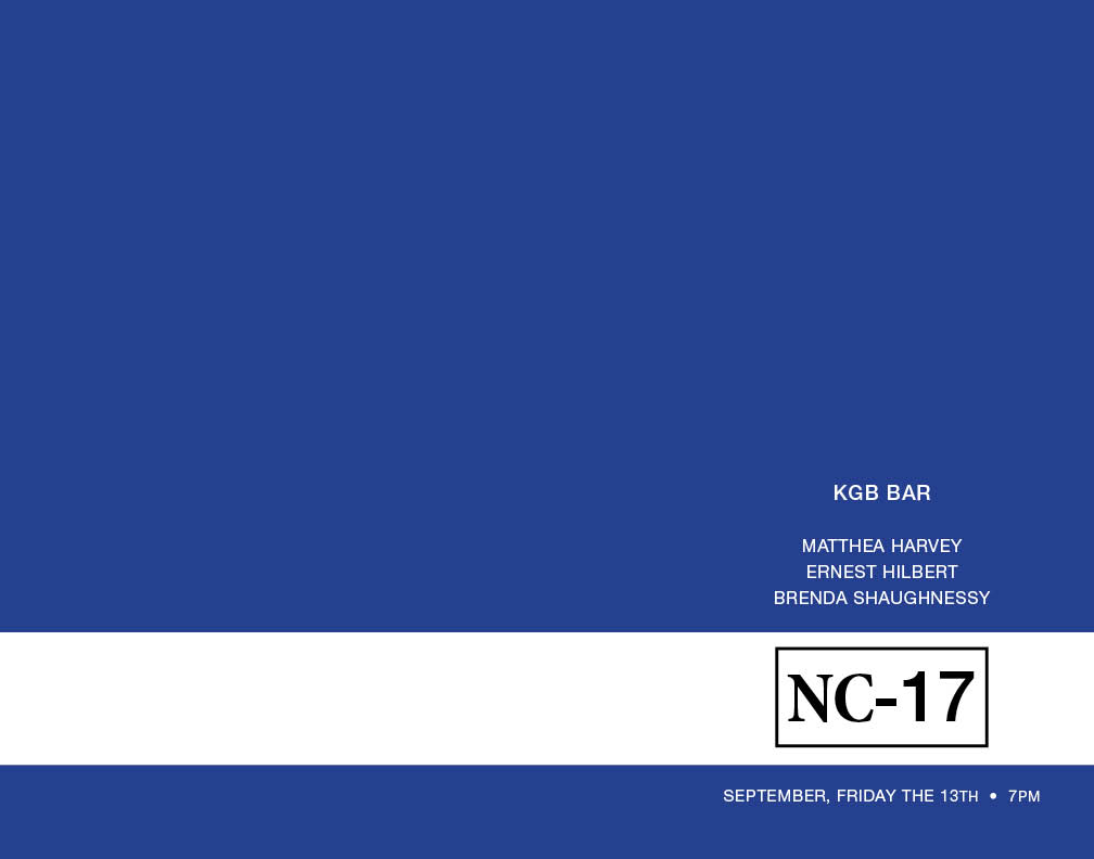
MERCER, Jennifer. “NC-17 ON FRIDAY THE 13TH.” Poster Signed. Philadelphia: Nemean Lion Press, September 2013. Measures 11 by 14 inches.
Limited edition poster for the Friday September 13th Red Hen reading at KGB Bar in New York City, featuring poets Ernest Hilbert, Matthea Harvey, and Brenda Shaughnessy, hosted by Kate Gale, one of 12 numbered copies, some possibly signed by authors (and two proof copies, hors série), featuring the official Nemean Lion chop stamp on reverse.
The Motion Picture Association of America first used the rating “NC-17” (“No Children Under 17 Admitted”) in 1990 for the literary biopic Henry & June, which had initially been given an “X” rating. The “NC-17” rating has since been used to designate films of artist merit that contain “extreme emotional intensity, strong graphic non-stop language [sic], disturbing/startling images, and/or aberrational behavior” inappropriate for younger viewers but which do not necessarily constitute pornography. In addition to Helvetica Neue 65 Medium, Mercer deployed 55 Roman for variety. It is the eighth poster issued by Nemean Lion Press and is currently unobtainable.
* * *
 “(TO US HILARIOUS)”: LIMITED EDITION SIGNED POSTER ANNOUNCING ERNEST HILBERT, DAVID YEZZI, ELIZABETH GOLD, AND DANIEL NESTER’S READING AT ROBIN’S BOOKS, PHILADELPHIA, SEPTEMBER 2011
MERCER, Jennifer. “DEEMED TRULY NEFARIOUS (TO US HILARIOUS)”. Poster Signed. Philadelphia: Nemean Lion Press, September 2011. Measures 11 by 17 inches.
Limited edition poster for the September 27th, 2011, reading at Robin’s Books/Moonstone Arts Center, featuring authors Ernest Hilbert, Elizabeth Gold, Daniel Nester, and David Yezzi, one of 12 numbered copies, signed by the designer, all four authors, and host Lynn Levin (as well as two proof copies, hors série), featuring the official Nemean Lion chop stamp on reverse.
Designer Jennifer Mercer printed “DEEMED TRULY NEFARIOUS (TO US HILARIOUS)” using the unusual Hamlet Handtooled typeface on 60lb polar matte paper. “DEEMED TRULY NEFARIOUS (TO US HILARIOUS)” is taken from Ernest Hilbert’s poem “In-School Suspension” and was selected by David Yezzi for the event’s name. The poem originally appeared in The New Criterion, which Yezzi edits. The illustration, by French engraver Gustave Doré, depicts twelfth-century Occitan troubadour Bertran de Born as consigned by Dante Alighieri to the eighth circle of Hell (Canto XXVIII, Inferno), where he was punished as a sower of discord (Henry II of England believed Bertran instigated the uprising of his son Henry the Young King). In Longfellow’s translation, de Born explains: “Because I parted persons so united, / Parted do I now bear my brain, alas!” Doré’s are among the most celebrated of illustrations for Dante; they won him the cross of the Legion of Honor (see Malan, 57-58). “The varied torments of the dwellers in Hell are shown [by Doré] with minute and sometimes shocking fidelity” (Ray, The Art of the French Illustrated Book, 327-28). L’Enfer de Dante Alighieri avec les Dessins de Gustave Dore, Traduction Française de Pier-Angelo Fiorentino Accompagné du Texte Italien first appeared in Paris, published by Hachette, 1860. The plate was selected because Dante appears to be doing a “face-palm” in exasperation at the sight of de Born parading, nude, with his head held above his torso, a scene that harmonizes agreeably with the substance of the poem “In-School Suspension.” It is the seventh poster issued by Nemean Lion Press and is currently unobtainable.
* * *
 LIMITED EDITION SIGNED POSTER ANNOUNCING ERNEST HILBERT, TIMOTHY DONNELLY, AND MATTHEW ZAPRUDER’S READING AT ROBIN’S BOOKS, PHILADELPHIA, APRIL 2011
MERCER, Jennifer. “YOU WERE BORN TO FEEL A WAY YOU DON’T HAVE A WORD FOR.” Poster Signed. Philadelphia: Nemean Lion Press, March 2011. Measures 11 by 17 inches.
Limited edition poster for the April 12th, 2011, reading at Robin’s Books/Moonstone Arts Center to celebrate National Poetry Month, featuring poets Ernest Hilbert, Timothy Donnelly, and Matthew Zapruder, one of 12 numbered copies, signed by the designer, all three authors, and emcee, Quincy Lehr (and two proof copies, hors série), featuring the official Nemean Lion chop stamp on reverse.
Designer Jennifer Mercer printed “YOU WERE BORN TO FEEL A WAY YOU DON’T HAVE A WORD FOR” on 60lb polar matte paper. She selected the unusual GF Ordner Inverted typeface because it reminded her of plastic labels produced by portable handheld labelers produced by Dymo and other small manufacturers, common in the early 1980s before the widespread use of computer printers and the late-model Brother P-touch®. The event borrows its name from the last two lines of Matthew Zapruder’s poem “For Hannah,” which first appeared on March 31st, 2009, in the online magazine Slate and later in his collection Come on All You Ghosts (Copper Canyon, 2010). Based on studies of chrome and body construction, automobile aficionados have identified the car parked in front of the bookstore in the background image as a 1975 Chevy Camaro, inspiration for the song “Bitchin’ Camaro” by the Dead Milkmen (though some have insisted it is a Pontiac Firebird 1973-74). It is the sixth poster issued by Nemean Lion Press and is currently unobtainable.
* * *
 “RAGING PASSIONS AND CLASHING SWORDS!” LIMITED EDITION SIGNED POSTER ADVERTISING ERNEST HILBERT AND TIM GREEN’S READING AT THE RUSKIN ARTS CLUB, APRIL 2010
MALLON, Kara. “HOLLYWOOD BABYLON.” Poster Signed. Philadelphia: Nemean Lion Press, 2010. Measures 10 ¼ by 12 ¾ inches.
Limited edition poster for the April 11th, 2010 Red Hen Press reading at the Ruskin Arts Club in Los Angeles, featuring poets Ernest Hilbert and Tim Green, introduced by Kate Gale, one 12 numbered copies, signed by both authors (and two proof copies, hors série), featuring the Nemean Lion chop stamp on reverse.
Designer Kara Mallon’s poster makes use of several sources relating to golden-age Hollywood. A film still from D.W. Griffith’s monumental 1916 film Intolerance—which called for over 3,000 extras and covered 2,500 years of history—serves as the background for the poster. “Hollywood Babylon” refers to avant-garde filmmaker Kenneth Anger’s classic account of scandal and misbehavior in pre-WWII Hollywood. Banned ten days after its first publication in 1965, the book remained unavailable until its second issue in 1975. “Raging passions and clashing swords / in the pitiless desert wastes” is the tag line for the fictitious 1951 movie (really a movie-within-a-movie) Sand Pirates of the Sahara, which appeared in 2001’s The Majestic. This event was supported by Poets & Writers, Inc. through a grant it received from The James Irvine Foundation. The Ruskin Art Club, founded in 1888, is Los Angeles’ oldest cultural association. Its 1922 clubhouse was declared a Los Angeles Historical Monument in 1997. It is the fifth poster issued by Nemean Lion Press and is currently unobtainable.
* * *

“I WOULDN’T WORRY ABOUT IT . . . IT’S NOT A BIG COLLEGE TOWN”: LIMITED EDITION SIGNED POSTER ADVERTISING ERNEST HILBERT AND MARK SCHORR’S READING AT PIERRE MENARD GALLERY, NOVEMBER 2009
MALLON, Kara. “BOSTON POETRY UNION READING.” Poster Signed. Philadelphia: Nemean Lion Press, March 2009. Measures 11 by 14 inches.
Limited edition poster for the November 12th, 2009 Boston Poetry Union reading at Pierre Menard Gallery on Harvard Square to celebrate the release of the second issue of 66: A Journal of the Sonnet, featuring poets Ernest Hilbert and Mark Shorr, one 12 numbered copies, signed by the designer, both authors, and three promoters (and two proof copies, hors série), featuring the official Nemean Lion chop stamp on reverse.
Cutting-edge designer Kara Mallon’s poster is part of the recent wave of minimalist, sans-serif designs that follow in the wake of the popular documentary Helvetica (2007). Helvetica, among the most common of sans-serif typefaces, was developed in 1957 by Swiss designer Max Miedinger. Advertising columnist Leslie Savan has remarked that “Helvetica has almost . . . a perfect balance of push and pull in its letters.” Mallon additionally used the Ariel font for the PO/ET/RY column design. The headline quote is taken from the rockumentary Spinal Tap. It is band manager Ian’s cagey response to the news that the Boston concert has been canceled due to lack of interest. It is the fourth poster issued by Nemean Lion Press and is currently unobtainable.
* * *
 “UNREAL AS A SONG”: LIMITED EDITION SIGNED POSTER ADVERTISING NATIONAL POETRY MONTH READING AT HEAD HOUSE BOOKS, APRIL 2009
MALLON, Kara. “Unreal as a Song.” Poster Signed. Philadelphia: Nemean Lion Press, April 2009. Measures 8 ½ by 11 inches on cougar uncoated white card stock.
Limited edition poster for the April 16th, 2009 “National Poetry Month” reading at Head House Books in Philadelphia, featuring Ernest Hilbert, Lynn Levin, and Paul Siegell, one 24 numbered copies, signed by all three authors and designer (an additional two proof copies, hors série, are unsigned).
“Unreal as a Song” was inspired in part by the title cards of Wes Anderson’s movies. The type is set in Futura Bold, a font preferred by Anderson both in his movies and their supporting materials. A geometric sans-serif type developed between 1924 and 1926 by Paul Renner, Futura owes much to geometric elements associated with Bauhaus design style. The type is arranged over a photograph taken by Mallon in Temple University’s Paley Library in 2007. Mallon has also designed posters for a September 2008 Bowery Poetry Club reading and an April 2009 KGB Red Room reading. This is the third in her ongoing series. “Unreal as a Song” references Hilbert’s poem “Mirage,” from his collection Sixty Sonnets. It is the third poster issued by Nemean Lion Press and is currently unobtainable.
* * *
 “BOOKS MATTER!”: LIMITED EDITION SIGNED POSTER ADVERTISING RED HEN READING AT KGB BAR, APRIL 2009
MALLON, Kara. “KGB BAR.” Poster Signed. Philadelphia: Nemean Lion Press, March 2009. Measures 11 by 14 inches.
Limited edition poster for the April 3rd, 2009 “Red Hen in New York” Reading Series at KGB Bar in Manhattan, featuring Ernest Hilbert, Elise Paschen, Timothy Green, and Greg Sanders, one 24 numbered copies, signed by all four authors and designer (and two proof copies, hors série).
Kara Mallon’s poster is part of the recent wave of minimalist, sans-serif designs that follow in the wake of the popular documentary Helvetica (2007). Helvetica, among the most common of sans-serif typefaces, was developed in 1957 by Swiss designer Max Miedinger. Advertising columnist Leslie Savan has remarked that “Helvetica has almost . . . a perfect balance of push and pull in its letters.” “Books Matter!” is the slogan for Red Hen Press and appears on their promotional merchandise. An unspecified number of copies were additionally signed by Kate Gale, publisher of Red Hen Press. It is the second poster issued by Nemean Lion Press and is currently unobtainable.
* * *
 “THREE ON THE BOWERY”: LIMITED EDITION SIGNED POSTER ADVERTISING RED HEN READING AT BOWERY POETRY CLUB, SEPTEMBER 2008
MALLON, Kara. “POETRY & PROSE.” Poster Signed. Philadelphia: Nemean Lion Press, September 2008. Measures 10 by 14 inches.
Limited edition poster designed to promote the September 14th, 2008 Red Hen Reading Series at the Bowery Poetry Club in New York City, featuring Ernest Hilbert, Michael Quadland, and Adam Kirsch, limited to 10 copies signed by all three authors and host Kate Gale.
Kara Mallon’s poster is an example of appropriation or recycling of popular images in an attempt to not only repurpose their practical elements but also to breathe new life into the art form. “These days, the few non-video visuals that remain part of the music experience usually get shrunk down to fit on an iPod screen, if they show up at all. One holdout that’s not only still alive, but thriving, however, is the custom designed concert poster” (Billboard). Based on an early concert poster for the popular British band The Police, Mallon’s poster honors the DIY elements of rock music, as well as both the collage techniques of Richard Hamilton and the parody icons of British graffiti artist Bansky. Three copies of the ten printed for the event were signed by the three authors, host, and designer. The remaining seven in the series were signed by the three authors and host only. It is the first poster issued by Nemean Lion Press and is currently unobtainable.
* * *
 LIMITED-EDITION POSTER ADVERTISING
RELEASE OF THE ALBUM ELEGIES & LAMENTS
ON THE IDES OF MARCH, 2013
MERCER, Jennifer (designer) and Matthew Wright (photographer). “Ernest Hilbert with Legendary Misbehavior Record Release.” Poster. Philadelphia: Nemean Lion Press, March 2013. Measures 11 by 17 inches.
Limited-edition poster for the March 15th (“Ides of March”) release of Ernest Hilbert’s avant-garde spoken-word album Elegies & Laments, limited to twelve unnumbered copies (and one reduced proof copy).
Despite the dismal history of attempts by rock artists and poets from the 1950s to the present to make a legitimately entertaining spoken word album, local Philadelphia rock veterans Marc Hildenberger and Dave Young remained optimistic and recorded poet Ernest Hilbert reading sixteen poems they selected from his first book, Sixty Sonnets. They then composed and performed music around the recorded poems as a “score,” as one would for a film. It soon became an untitled Pub Can Records project, with no release date and an ambiguous budget and remained that way for several years. The album that would eventually be titled Elegies & Laments grew over time to include a string orchestra (scored by young composer Christopher LaRosa), a battery of vintage instruments and electronics, mad-scientist rewirings, experimental technologies, session musicians, guest readers, and a harp.
Hilbert’s record release poster is modeled on a similar poster for lo-fi-Psychedelic rock musician Kurt Vile’s Smoke Ring for My Halo, his fourth studio album, which was released on March 8, 2011 on Matador Records. Hilbert encountered and photographed the poster during a visit to famous Philadelphia record shop A.K.A. Records on 2nd Street. For Hilbert’s poster, Jennifer Mercer used Helvetica Neue (T1) 77 Bold Condensed and 67 Medium Condensed fonts. The band and author photographs in the lower left and upper right of the poster were taken by photographer Matthew Wright in an abandoned warehouse in southwest Philadelphia, several blocks from Hilbert’s home, in the first week of December 2012. The album cover on the upper right was designed by Jennifer Mercer as a complement to the cover of Hilbert’s first commercially-published book, Sixty Sonnets (which also benefited from a cover designed by Mercer). The final image, of the compact disc itself, in the lower right, was designed in-house by Furnace Records, who manufactured both the compact disc (domestically) and the 180-gram white and black vinyl records (in Holland). Because Hilbert’s record release party on March 16th, 2013 (the Saturday evening before St. Patrick’s Day) was so rowdy and oversubscribed, relatively few copies of the poster were issued to the public that night (the label neglected to offer them until the end of the night, long after the live performance of the album by Ernest Hilbert with his five-piece electric band Legendary Misbehavior). Remaining copies were retained by the record label, which issued them piecemeal to members of the project and musicians who performed either on the album or live with Hilbert. The poster is now unobtainable by members of the public.
* * *
 MERCER, Jennifer. “E-VERSE EQUINOX READING SERIES.” Poster. Philadelphia: Nemean Lion Press, March 2012. Measures 14.5 by 18 inches.
Poster designed by Jennifer Mercer to promote the new E-Verse Equinox Reading Series, inaugurated in March 2012 and hosted by Ernest Hilbert at Robin’s Books, Philadelphia, on the spring and autumn equinoxes annually, featuring both local and national poets.
The poster’s background image is the Cetus constellation as it appeared in the celestial map plate from Firmamentum Sobiescianum sive Uranographia by Johannes Hevelius, 1690. “In ancient Greek, the word ketos (Ancient Greek: Κῆτος, Kētos, plural cetea Ancient Greek: κήτεα), Latinized as cetus, denotes a large fish, a whale, a shark, or a sea monster (Liddell, Henry and Robert Scott. 19406. A Greek-English Lexicon, revised by H.S. Jones and R. McKenzie, Oxford: Clarendon Press). The sea monsters slain by Perseus and Heracles were each referred to as a cetus by ancient sources. The term cetacean originates from cetus. In Greek art, cetea were depicted as serpentine fish. The name of the mythological figure Ceto is derived from ketos. The name of the constellation Cetus also derives from this word” (WP). “The Hevelius Firmamentum was the first star atlas to rival Bayer’s Uranometria in accuracy, utility, innovation, and influence. Hevelius was perhaps the most active observational astronomer of the last half of the seventeenth century. His star atlas is notable for many reasons. It contains fifty-six large, exquisite, double-page engraved star maps, each based upon drawings by the famous Polish artist Andreas Stech, who was also living and working in Dantzig at the end of the 17th century. The star positions for the charts were derived from Hevelius’s own star catalog, based on his own observations, which was first published along with the atlas. It is unique among the Grand Atlases in choosing to depict the constellations as they would appear on a globe, that is, from the outside looking in, rather than from a geocentric point of view, as Bayer and most others adopted. So Aquila and Antinous swoop down to the right, rather than to the left as in Bayer” (Linda Hall Library of Science, Engineering, and Technology). Readers for the series include Matthew Zapruder, Timothy Donnelly, Elizabeth Gold, Daniel Nester, Afaa Michael Weaver, George Green, Bojan Louis, Michael Dickman, Jehanne Dubrow, Catie Rosemurgy, Thomas Devaney, and David Yezzi.
* * *
Jennifer Mercer also designs a selection of products for the E-Verse website, including key chain bottle openers, coffee mugs, shot glasses, pens, temporary tattoos, vinyl stickers, magnets, and guitar picks.

* * *
 Ernest Hilbert performance with Mercury Radio Theater
Poster designed by Greg Lytle for Ernest Hilbert’s guest appearance with conceptual post-punk band Mercury Radio Theater at the legendary Khyber Pass rock club in Philadelphia on May 8th, 2009. Lytle is a celebrated illustrator and animator based in Brooklyn, NY. The strutting robot depicted on the poster alludes to those described by H.G. Wells in his 1898 novel The War of the Worlds: “I did not dare to go back towards the pit, but I felt a passionate longing to peer into it. I began walking, therefore, in a big curve, seeking some point of vantage and continually looking at the sand heaps that hid these newcomers to our earth. Once a leash of thin black whips, like the arms of an octopus, flashed across the sunset and was immediately withdrawn, and afterwards a thin rod rose up, joint by joint, bearing at its apex a circular disk that spun with a wobbling motion. What could be going on there?” The radio broadcast of Orson Welles’ adaptation by his Mercury Radio Theater players (as part of “The Mercury Theatre on the Air”) October 30th, 1938 was so convincing that it caused widespread panic among listeners. Welles’s theater company lends its name to the band Mercury Radio Theater. Ernest Hilbert performed live spoken segments of a short sequence called the “Lewis” episodes about a young boy who befriends a monster that avenges him upon his bullies. Learn more about Lytle’s work at www.gregorylytle.com.
* * *
 “SOLEMN CERMONY OF PRESIDENT,
EXECUTIVE, AND, AFTER ALL, THE POET”:
FINE LIMITED EDITION BROADSIDE
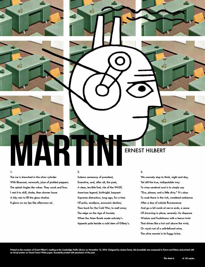
(HILBERT, Ernest) TANNY, Jessica. “Martini.” Cambridge, MA: Cambridge Public Library, 2014. Broadside. Measures 9 by 11 inches.
Signed limited edition broadside featuring the poem “Martini” by Ernest Hilbert, designed by artist Jessica Tanny and published by the Cambridge Public Library on the occasion of Ernest Hilbert’s reading there on November 13th, 2014, in an edition of 60 numbered copies, 1-10 signed by author, artist, and promoter Daniel Wuenschel, 11-25 signed by Hilbert only, and 41-50 signed by Hilbert for subscribers, including the Woodberry Poetry Room at Harvard University. All signed copies in the series include Hilbert’s Nemean Lion chop stamp.
After reading Barnaby Conrad III’s 1995 book The Martini: An Illustrated History of an American Classic in 2010, Ernest Hilbert, a known aficionado of the martini, was inspired to compose a poem bringing together the ceremonial, historical, alchemical properties of the cocktail. Artist Jessica Tanny described her creative process, explaining “I initially explored various ways to express some of the themes I saw in the poem, especially the martini as a link to a different era. In the end, it was Hilbert’s explanation [in correspondence] of ‘the martini as inoculation against the disease of modernity, an embalming after a day’s battle, and, of course, a form of ritual communion’ that struck the balance for me in the chosen design. The day’s battle: the monotony of the office as represented by repeating institutional green desks. The disease of modernity: man as industry as represented by the Charles Anderson illustration. The martini as inoculation: the martinis on the desk look like permanent fixtures as they are the only thing on those desks other than the telephones.” Bluecoat is an American dry gin, introduced in 2006 by Philadelphia Distilling, described as an “‘American-style’ gin that emphasizes citrus over juniper berries.” The poem first appeared in Poetry Northeast, issue 2, fall 2012, a publication of the Boston Poetry Union, and later reprinted in the summer 2014 issue of Modern Drunkard magazine. The text is set in Futura and Bebas and printed with ink jet printer on French Smart White 100lb cover paper, hand numbered in silver pencil by Tanny.
* * *
 “REACHES FOR, AND FINDS, THE SUBLIME”: POSTER FOR ERNEST HILBERT AND DAVID BLAIR’S HASTINGS ROOM READING
(HILBERT, Ernest) FERRARO, Paul. Cambridge, MA: First Congregational Church of Cambridge, 2015. Poster. Measures 9 by 11 inches.
Poster created for Ernest Hilbert and David Blair’s appearance for the Hastings Room Reading Series at the First Congregational Church of Cambridge, MA, on November 12th, 2015, twelve total copies, six signed by the poets as well as hosts Michael Steffen and Daniel Wuenschel and designer Paul Ferraro, distributed the evening of the reading.
At the well-attended event, David Blair read poems from his 2007 book Ascension Days as well as his then-forthcoming volumes Friends with Dogs and Arsonville. Hilbert read exclusively from his third book, Caligulan, which had been published that September. Michael Steffen introduced the poets, remarking about Hilbert “the poems in Caligulan have a wonderful resonance. These new poems have something very ‘Cal’ [Robert Lowell] about them, the very personal tone and settings combined with extraordinary perceptions. The fishing boats in ‘Barnegat Light’ returning ‘as silhouettes’ is a haunting, beautiful image. At unexpected moments, Hilbert reaches for, and finds, the sublime.” Ferraro, who graduated from the New England Institute of Art, is known for the “pulse of color” and “awareness of space” in his work The original run of posters, printed on high-quality paper and intended as a signed-limited series, mysteriously went missing the day before the reading and remain at large. Host Daniel Wuenschel hastily printed twelve copies of the present posters on lightweight paper at the Cambridge Public Library in order to hand them out the night of the reading. Six copies are known to contain the signatures of the two authors, two hosts, and designer. Other copies were posted around Cambridge that evening. A charming and scarce item of ephemera.
* * *
 “NAME CHECKS EVERYTHING FROM ZIPPOS TO STAR WARS FIGURES TO PLATO AND THOMAS EAKINS”: POSTER FOR ERNEST HILBERT AND JERICHO BROWN’S READING FOR FREQUENCY NORTH
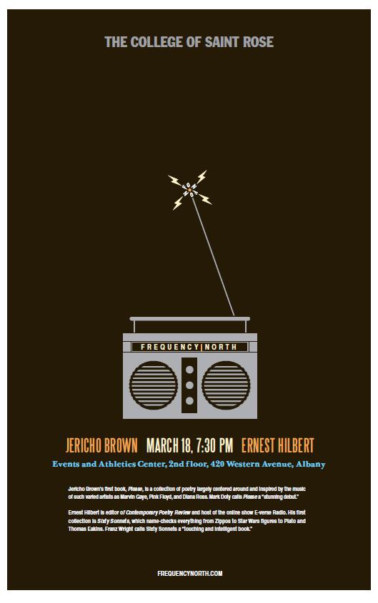
(HILBERT, Ernest) HAMILTON, Mark and Chris Parody. Albany, NY, 2010. Poster. Measures 11 by 17 inches.
Poster created for Ernest Hilbert and Jericho Brown’s appearance at the Frequency North Reading Series at the College of St. Rose in Albany, New York, printed in an unknown number of copies, distributed the week of the reading.
On March 18th, 2010, poets Ernest Hilbert and Jericho Brown met with students at the College of St. Rose to discuss the role of the poet in America. That evening, the two delivered a reading to a full room at the college’s Events and Athletics Center, hosted by Daniel Nester, the series founder. Brown, a former speech writer for the mayor of New Orleans and professor at Emory University, read from his first book, Please (2008), which won an American Book Award. Hilbert read from his first book, Sixty Sonnets (2009), which the poster explains “name checks everything from Zippos to Star Wars figures to Plato and Thomas Eakins.” Hilbert read for half an hour despite a furious hangover acquired the night before, when he had attended a performance of David Yezzi’s verse drama On the Rocks at the Bowery Poetry Club in New York City. The two went drinking in area bars and ended in the small hours at the Chelsea Hotel, where Hilbert was staying with his wife. Mark Hamilton and Chris Parody, who designed the poster, are recipients of local awards for the series, including gold and silver ADDY® awards.
Critically-acclaimed poet, essayist, and memoirist Daniel Nester launched the Frequency North Reading Series in 2005. Its featured authors have included Rick Moody, Sharon Mesmer, Eduardo C. Corral, Darin Strauss, and Melissa Broder. “In creating the series . . . Nester set about to plug what he perceived as a large gap in the literary events offered in the Capital Region. He purposely designed the series to be ‘aggressively eclectic.’” Nester and a team of his assistants distributed copies of the poster to both college students and local citizens the week of the reading. The same image was issued as postcards and distributed digitally. A charming and scarce item of ephemera.
* * *
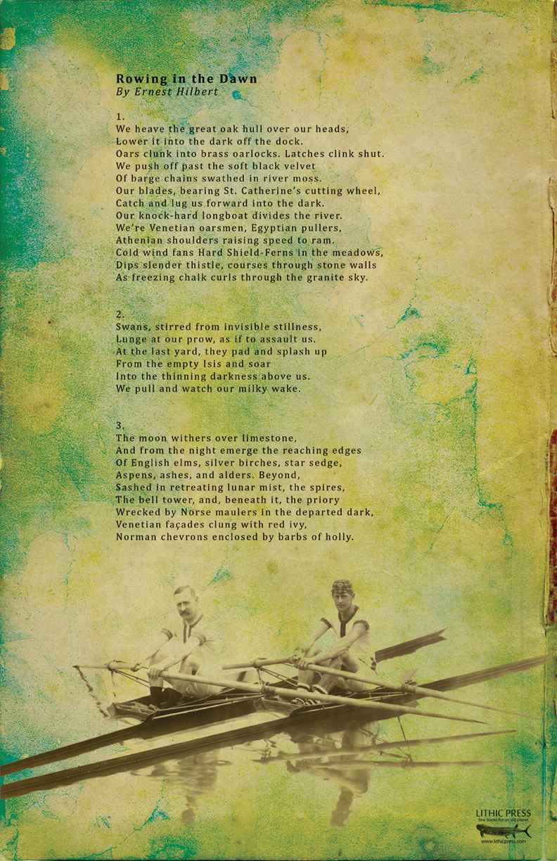 “WE’RE VENETIAN OARSMEN, EGYPTIAN PULLERS”: FULL-COLOR LITHIC PRESS BROADSIDE
HILBERT, Ernest and HARVEY, Kyle. “Rowing in the Dawn.” Fruita, CO: Lithic Press, 2014. Broadside. Measures 11 by 17 inches.
Full-color broadside featuring the poem “Rowing in the Dawn” by Ernest Hilbert designed by Kyle Harvey and published by Lithic Press, in an unstated limitation.
In 1994, Ernest Hilbert, recently arrived as a graduate student in the department of English Language and Literature at Oxford University, joined one of the “eights” rowing teams for his Oxford college, St. Catherine’s. The team acquitted itself soundly in that year’s Christ Church Regatta, held in the seventh week of Michaelmas term, winning two races though ultimately bested by the unrivaled Oriel squad. Years later, while living in Philadelphia, a city known for its boathouses and university rowing teams as well as Thomas Eakins’ iconic paintings of rowers such as the champion Biglin Brothers, Hilbert revisited his mornings on the Isis River in the poem “Rowing in the Dawn.” The poem first appeared in the Oxonian Review and is slated for inclusion in the collection Last One Out.
Designer Kyle Harvey remarked that “the words ‘oak,’ ‘dark,’ ‘dock,’ ‘clunk,’ ‘oarlocks,’ ‘clink’ are all vividly replicative of the sounds that wood, metal and water make. The combination of these words with the title led me to think of light in the morning, the air on the water, these sounds before the sounds of day dull them to our listening. Dawn is a magical time on the water. The primary image is a photo of courtesy of the National Rowing Foundation’s Hall of Fame. I collaged and overlaid a handful of layers to try and compliment the color and sounds of the water and sky at dawn.” Lithic Press was found by Danny Rosen in 2006. Formerly an astronomer and geologist, Rosen now devotes his energies “all manner of fine poetry presentations” with Lithic Press, which specializes in chapbooks, full-length poetry collections, and broadsides. Copies are available from Lithic Press or directly from the author while supplies last.
* * *
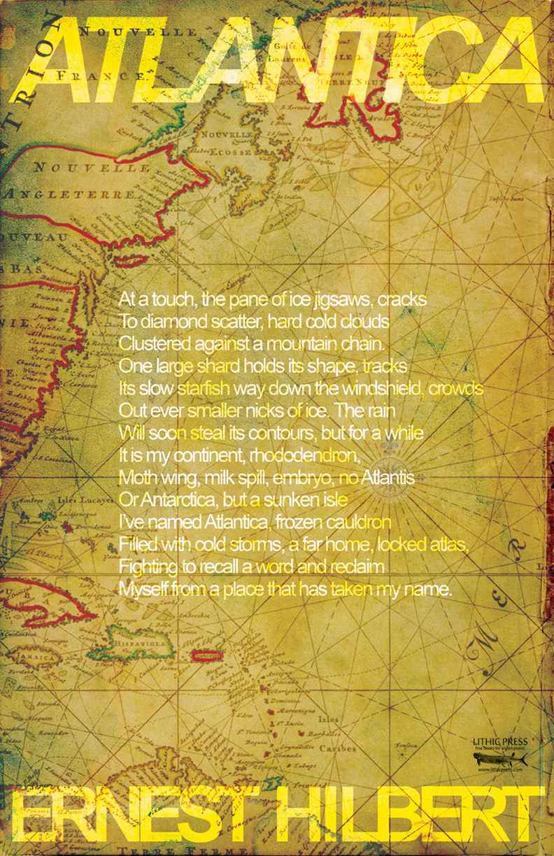 “A SUNKEN ISLE / I’VE NAMED ATLANTICA”: FINE LIMITED EDITION BROADSIDE
HILBERT, Ernest and HARVEY, Kyle. “Atlantica.” Fruita, CO: Lithic Press, 2014. Broadside. Measures 11 by 17 inches.
Full-color broadside featuring the poem “Atlantica” by Ernest Hilbert designed by Kyle Harvey and published by Lithic Press, in an unstated limitation.
Though the “Atlantica” of the poem is purely an invention of the poet’s imagination, the term does, in fact, refer to an oceanographic formation. “Atlantica (Greek: Ατλαντικα; Atlantika) is the name given to an ancient continent that formed during the Proterozoic about 2,000 million years ago (two billion years ago, Ga) from various 2 Ga cratons located in what is now West Africa and eastern South America. The name, introduced by John Rogers 1996 (“A History of Continents in the Past Three Billion Years,” The Journal of Geology), was chosen because the continent opened up to form the South Atlantic Ocean” (Wikipedia). The poem is intended for inclusion in the collection Caligulan.
Designer Harvey Kyles explains that the poem’s “words all lend themselves to geometric mapping lines. There is a sense of nostalgia and mystery to the poem that reminded me of a treasure map or exotic local. I Googled antique maps, which are a favorite of mine in collaging anyway, and once again layered the image together. Unique to this broadside, between the two, is the way that I overlaid the text.” Copies are available from Lithic Press or directly from the author while supplies last.
* * *
 “A FEW DRINKS AND WE’RE ALL POETS”
(HILBERT, Ernest) LANG, Stephen. “A Few Drinks and We’re All Poets.” Philadelphia: NP, 2013. Fan poster. Measures 7 ½ by 7 ½ inches.
Full-color fan art by Stephen Lang, using the title of Hilbert’s poem “A Few Drinks and We’re All Poets” from the “Legendary Misbehavior” chapter of his debut collection, Sixty Sonnets, limited to three copies, located in the homes of Lang and Hilbert and also in the kitchen at the Philadelphia office of Bauman Rare Books. A charming example of fan art.
We’ll head out, you and me, have a pint, or
Maybe three, a cool thin ale, like sunlight,
Or a lager, toke the dregs of the day.
We’ll catch up, slide down, the barmaid will pour
And we’ll lean back from the compulsory fight
Over a highborn lady or new play.
A few shots, icy beaker of thinned gin,
Warm welcome of a good whiskey, and not
One moment to spare, as the bell will have rung.
They will pat you for guns on the way in,
And you’ll have a fine time, if you don’t get shot.
This is our last stark, sad chance to feel young.
What else to say of our faint star-fall town,
But we’ve sunk so low, we might as well drown.
* * *
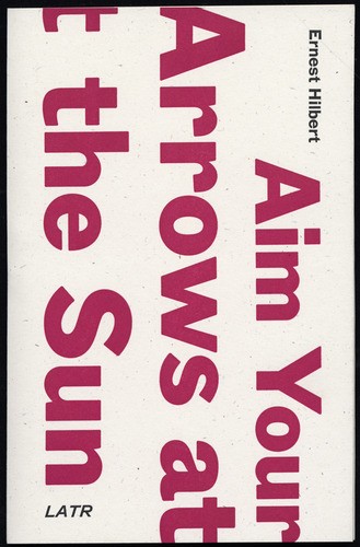 In 2009, LATR Editions in New York City issued a hand-sewn, limited-edition chapbook of Hilbert’s poems titled Aim Your Arrows at the Sun.
“HILBERT IS DRAWN TO SCENES OF CARNAGE, WHERE THE TRUE FACE OF HUMANITY SEEMS TO REVEAL ITSELF”: FIRST, LIMITED EDITION OF AIM YOUR ARROWS AT THE SUN
HILBERT, Ernest. Aim Your Arrows at the Sun. New York: LATR Editions, 2009. Tall octavo, letterpress paper wrappers.
First edition of Hilbert’s first chapbook of poetry, limited to 250 copies, hand-sewn covers designed and printed by Woodside Press, with a foreword by critic Adam Kirsch.
“To be haunted, for an American poet today, is a rare and enviable condition. Not by personal demons—everyone has those, and when poets write about them they are really haunting themselves. To be genuinely haunted, as Ernest Hilbert is in these outward- and backward-looking poems, one must be conscious of the past, and of the chastening contrast between the past and the present; in other words, one must have a sense of history. And history is the ‘bruising storm’ that ‘matures’ on the horizon of Hilbert’s poems, as he writes in ‘Selv’oscura,’ while the poet remains ‘swaddled’ in the untrustworthy comfort of the present. When Hilbert is visited by the past, in these poems at least, it is by grand and violent phantoms: ‘I read on about the lives and deaths of kings,’ he writes in a Lowellian phrase in ‘April Arsenal.’ Like Robert Lowell, Hilbert is drawn to scenes of carnage, where the true face of humanity seems to reveal itself. A destroyed tank in the Sinai Desert has weathered into landscape, its ‘long-ago blow and loss’ like an archeological reminder of the ways human beings, in the Middle East especially, keep returning to ancient patterns of violence: ‘proof that armies advanced this far / Before in the baffling waste,’ as Hilbert puts it in ‘On Passing the Remains of a T-62 in the Sinai.’ The most savage poems in Aim Your Arrows at the Sun use the past’s grandeur to reproach the pettiness of our world. In the Juvenalian ‘Bread and Circuses,’ Hilbert sees our TV shows and fast food as the equivalent of the largesse with which Rome’s rulers stupefied her people. After such humiliating contrasts, Hilbert and the reader can only take comfort in the truth stated in ‘Dining with Representatives of the Vatican Museum’—that it is art, including the art of poetry, that survives the past and incarnates it. Poems like the ones in Aim Your Arrows at the Sun are the ‘small remains of each man and each age’ that remind us of what is past and passing, and that will represent us in times to come” (Adam Kirsch). Adam Kirsch is the author of The Wounded Surgeon: Confession and Transformation in Six American Poets, The Modern Element: Essays on Contemporary Poetry, Why Trilling Matters, Rocket and Lightship: Essays on Literature and Ideas, The Global Novel: Writing the World in the 21st Century, The People and The Books: 18 Classics of Jewish Literature, and a biography of Benjamin Disraeli. He is on the seminar faculty of Columbia University’s Center for American Studies and is editor of the Weekend Section for The Wall Street Journal. The first issue contains “Kirsh” instead of “Kirsch” in the foreword attribution. Only copies sold at the launch reading at Melville House in Brooklyn, NY are known to be first issue. The remainder of the first issue was destroyed by the publisher, which reissued 215 corrected copies to fulfill the book’s stated limitation. Covers designs printed by the Woodside Press, a traditional letterpress printing studio located in the Brooklyn Navy Yard. The title of the collection derives from lines in the song “Take it as it Comes” by The Doors: “Time to walk / Time to run / Time to aim your arrows / At the sun.” Hand-sewn in letterpress stiff paper wraps. The first title from LATR editions. “On Passing the Remains of a T-62 in the Sinai,” “Two Portraits,” “At the 100th Anniversary of the Antiquarian Booksellers Association at the Royal Geographical Society,” “Bread and Circuses,” “Haunts,” Dining with Representatives of the Vatican Museum,” “Surrender of Breda,” and “Disasters of War” appeared again in Hilbert 2019 collection Last One Out. Currently unobtainable. It is possible that this title may re-emerge in both of its distinct issues on the rare book market in years to come.
Two chapbooks of Hilbert’s poems were issued by Red Dance Floor Press in Los Angeles in the 1990s, titled Lust the Experiment and Sleep Numbers, saddle-stapled in paper wraps with cover illustrations. The print runs were likely around 50 copies. No copies appear in the author’s own archive and none have ever appeared on the market. They are the rarest, though least significant, of the poet’s publications.